Date
May 2020
Category
UX/UI
Software Used
Figma
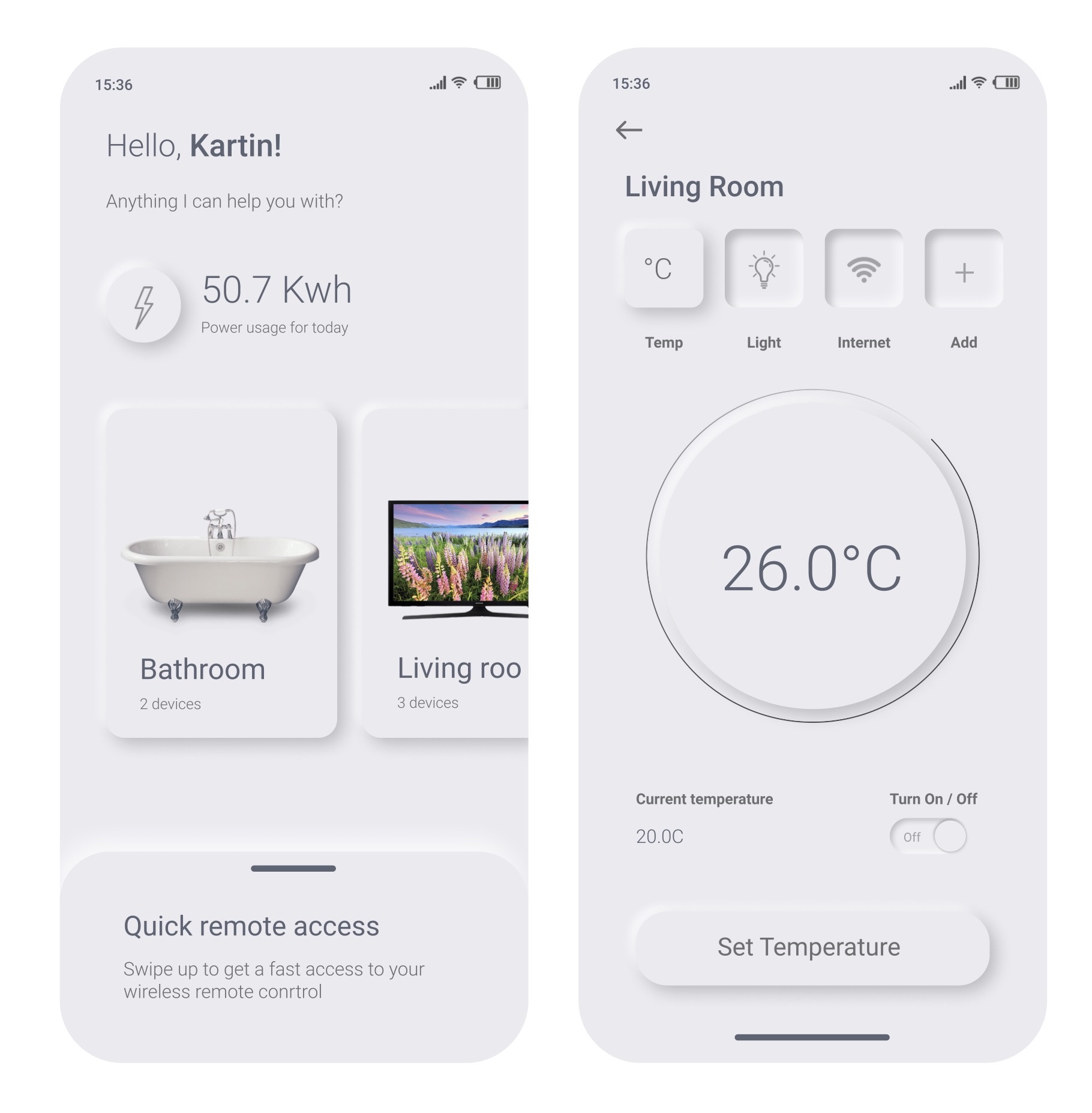
This is UI Daily's Design Challenge #007, designing a settings page. I came across this cool design of a smart home app settings page using neumorphism and decided to try my hand
at it, which is one of the major design trends in 2020. Check out the original, https://dribbble.com/shots/9833973-Daily-UI-007-Smart-Home-App-Settings it's amazing! Disclaimner: The design is
not my own, I am merely trying my hand at it.
Neumorphism or Neo-skeuomorphism, according to a medium article,
is a modern iteration of a style of designing web elements, frames and screens, which is also known as Skeuomorphism.
Now Skeuomorphism means to design mobile apps which mimics real world objects. This is known as “skeuomorphic” design.
Now that you know what these two terms mean, let me give you my two cents on what I love and hate about it.
I think there's something very cool and minimalistic about neumorphism. It looks realistic and blurs digital with reality using shadows
and highlights.
However, there are criticisms in terms its accessibility. There is no contrast between the shadows and the highlights, so it makes it makes it hard for
people who might have visual impairment to see. Additionally, the components take up way more space than the
normal flat design. This is very costly and inefficient when produced on a large scale.
I also wanted to create my own twist on it by using neon colours against a dark theme.
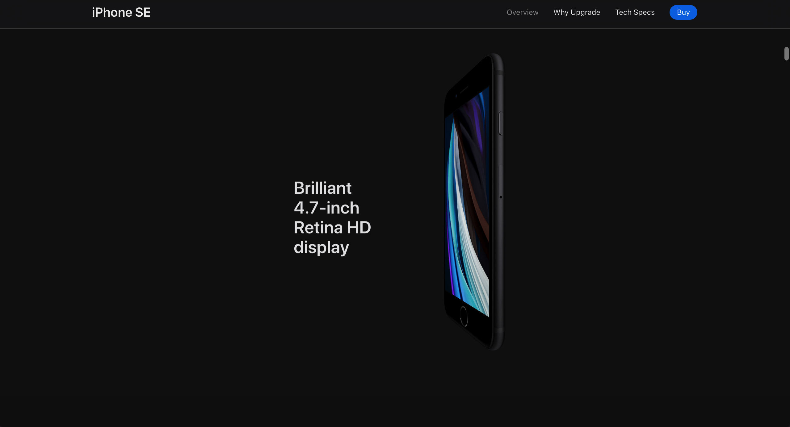
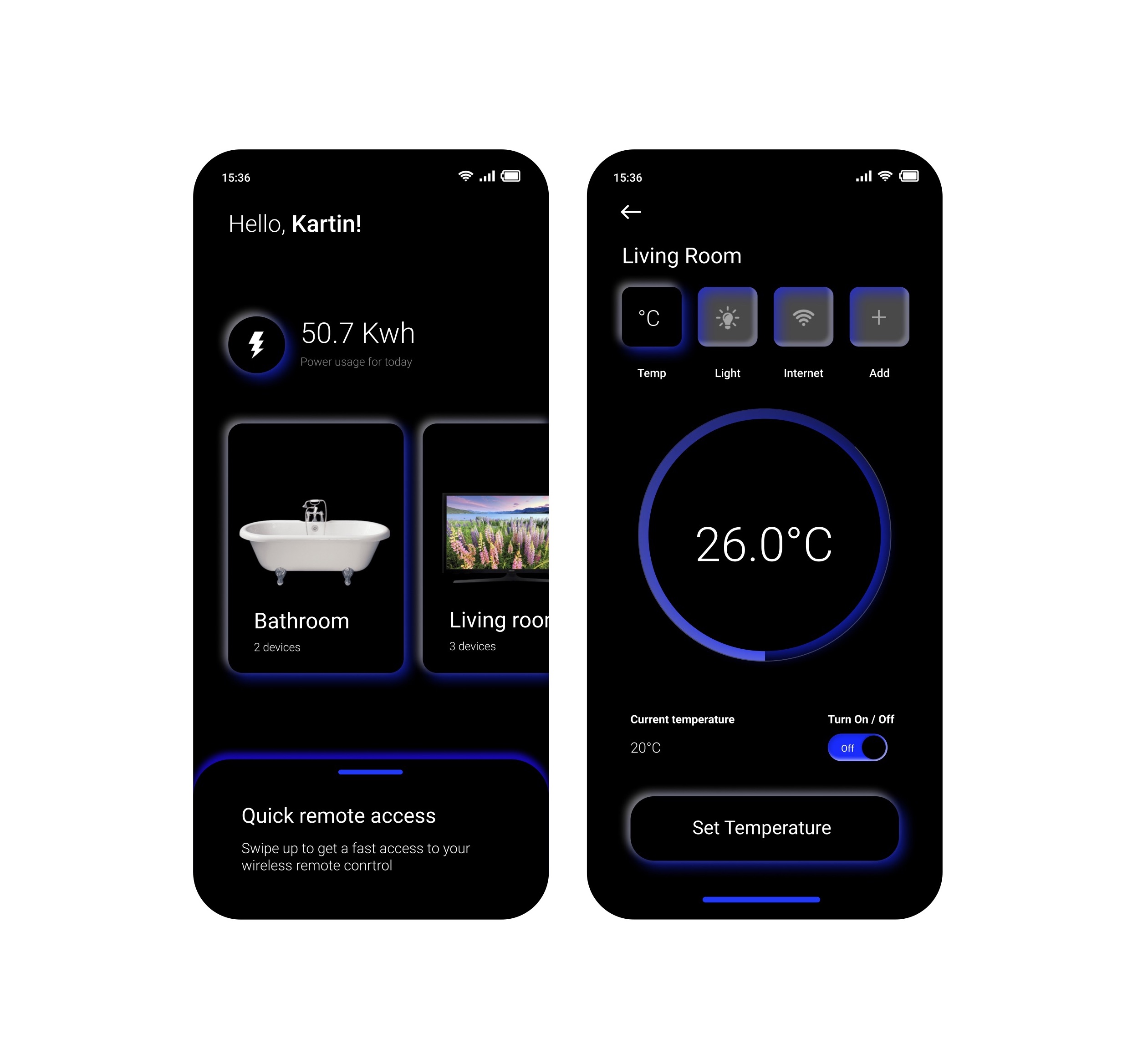 You see this technique being used in apple's promotion of their Iphone.